Remember when finding the food court felt like a quest in a low-res dungeon crawler? In 2026, mall map typography has leveled up from those blurry, pixelated nightmares into a neon-soaked dream of perfect legibility. You’re no longer squinting at a static board like a confused NPC; instead, you’re gliding through the atrium guided by variable fonts that pop harder than a synthwave bassline.
These modern layouts ditch the boring, sterile vibes for high-performance sans-serifs that even a speedrunner could read at top speed. Whether you’re hunting for the latest retro kicks or just trying to find the exit before the mall closes, the visual hierarchy is now crisp enough to satisfy any pro gamer. It’s all about that sweet spot where ADA-friendly accessibility meets a character-rich aesthetic that feels as fresh as a brand-new arcade cabinet.
If you ever felt like your local mall directory was shouting at you in neon, you can thank the Memphis Design movement for that glorious sensory overload. You probably remember squinting at a giant backlit board where the font was so thick and chunky it looked like it was made of digital bricks. These geometric sans serifs were the ultimate choice for 80s wayfinding because they felt futuristic and bold, even if they were just pointing you toward the nearest pretzel stand. Designers loved using perfectly round “O” shapes and razor-sharp “V” angles to give the map a high-energy vibe that screamed “The Future is Now.” It was the kind of typography that looked less like information and more like a set piece from a Saturday morning sitcom.
These beefy letters did not just sit there quietly, because they were usually surrounded by a chaotic party of squiggles, confetti triangles, and random pastel grids. You might have noticed that the “You Are Here” marker was often a giant red circle or a vibrating zig-zag that looked like it belonged on a Trapper Keeper. This intentional mess created a specific kind of visual electricity that made navigating the mall feel like a level in a retro arcade game. Even if the map was technically a bit of a headache to read, it captured that quintessential synthwave energy that turned a simple trip to the food court into an aesthetic experience. Those quirky shapes worked alongside the bold fonts to ensure that every directory board was a masterpiece of radical, over-the-top geometry.

Step into the neon glow of 1988 where the only thing more intense than your hairspray is the buzzing light box of a massive directory board. To make sure you could actually find the food court through the haze of a flickering fluorescent bulb, designers relied on high contrast vinyl lettering that practically screamed for attention. These letters were usually stuck onto dark plexiglass panels, creating a backlit effect that made the alphabet look like it was floating in a digital void. It was a lo-fi tech masterpiece where the harsh white light fought against the thick plastic to create a glowing aura around every store name. If you squinted just right, the way those letters popped against the shadows felt like you were staring into the mainframe of a retro arcade cabinet.
The secret sauce of this aesthetic was all in the kerning, which is just a fancy way of saying how much breathing room each letter had. Because the light behind the panel was often uneven and prone to buzzing like a swarm of angry bees, the letters needed wide spacing to stay readable. If the characters were huddled too close together, the glowing light would bleed over the edges and turn your favorite shoe store into a blurry blob of white light. Designers chose bold, chunky fonts that could survive the heat of a light box without melting into the background of the mall. You were basically navigating a physical version of a synthwave album cover, guided by glowing geometry and the steady hum of 20th century electricity.
You probably remember squinting at those giant, backlit directory boards while your parents dragged you toward the back of the mall. While the general store list used basic lettering, the anchor stores always got the royal treatment with high-end, cursive-inspired fonts that looked like they were signed by a Victorian ghost. These loopy, decorative scripts were meant to scream luxury and class, but they mostly just looked like a tangled mess of neon-lit spaghetti. You would find yourself tracing the gold-leafed swirls of a department store logo just to figure out if it was a place that sold fancy perfume or overpriced lawn furniture. It was all about the vibe of a high-society lifestyle, even if you were just there to buy a pack of trading cards.
The food court took this aesthetic and turned the volume up until the speakers blew out. Every pizza stand and taco hut tried to look like a five-star bistro by using aggressive, slanted scripts that looked like they were moving at warp speed. These fonts prioritized “cool” over actually being able to read the menu from five feet away. You would be starving and searching for the Orange Julius, only to get distracted by a font so stylized it looked like a secret code from a cyberpunk movie. It was a beautiful disaster of graphic design where the “S” looked like a lightning bolt and the “T” was basically a surfboard.
Looking back at these directory boards feels like stepping into a time machine fueled by hairspray and synthwave beats. The wayfinding designers of the era clearly believed that if a font did not have at least three unnecessary loops or a dramatic underline, it was not worth printing. We can laugh now at how hard it was to find the restroom because the signage was busy trying to look like a heavy metal album cover or a fancy wedding invitation. This era of commercial art was less about getting you to your destination and more about making sure you felt the 16-bit glamour of the shopping experience. It was an unintentional masterpiece of style over substance that defined the golden age of the American mall.
It is time to log off the mainframe and step into the neon glow of a simpler era. Those clunky, backlit directory boards were more than just plastic signs, they were unintentional masterpieces of analog design. You can still see the ghosts of those heavy, bold sans-serif fonts and the weirdly satisfying glow of a You Are Here sticker. Before every map became a flat and boring touchscreen, these physical wayfinding boards gave every suburban shopping center its own unique soul. They were built to last through high scores at the arcade and countless orange Julius runs, serving as the ultimate low-tech GPS for the synthwave generation.
You do not have to leave these aesthetic vibes in the past just because we live in a digital world now. Take those chunky letterforms and high-contrast color palettes and inject them directly into your next creative project. Whether you are building a website or just leveling up your social media game, that retro mall typography adds a layer of character that modern minimalism just cannot touch. It is all about capturing that specific feeling of wandering through a climate-controlled paradise under humming fluorescent lights. Go ahead and embrace the retro futuristic fonts and vibrant energy of the eighties to make your digital space stand out from the crowd.
Those retro maps relied on chunky geometric sans serifs and Memphis Design chaos to look futuristic. Designers used perfectly round letters and neon squiggles to give you that high-energy, Saturday morning cartoon vibe while you hunted for a corn dog.
Modern maps use variable fonts and high-performance sans-serifs that stay crisp even when you are sprinting to the exit. We have ditched the blurry NPC visuals for a high-res aesthetic that balances pro-gamer legibility with a sweet synthwave style.
Absolutely, because we prioritize a sharp visual hierarchy that satisfies both your inner designer and ADA accessibility standards. You get all the personality of a brand-new arcade cabinet without the headache of squinting at a static, low-res board.
Those giant red circles and zig-zags were designed to grab your attention amidst a sea of pastel grids and confetti triangles. It was all about making sure you did not get lost in the sensory overload of the 80s mall experience.
Yes, because clean typography acts like a HUD in a speedrun, allowing your brain to process directions instantly. By removing the digital bricks and clutter, we make sure you find the retro kicks or the food court before the mall shuts down for the night.
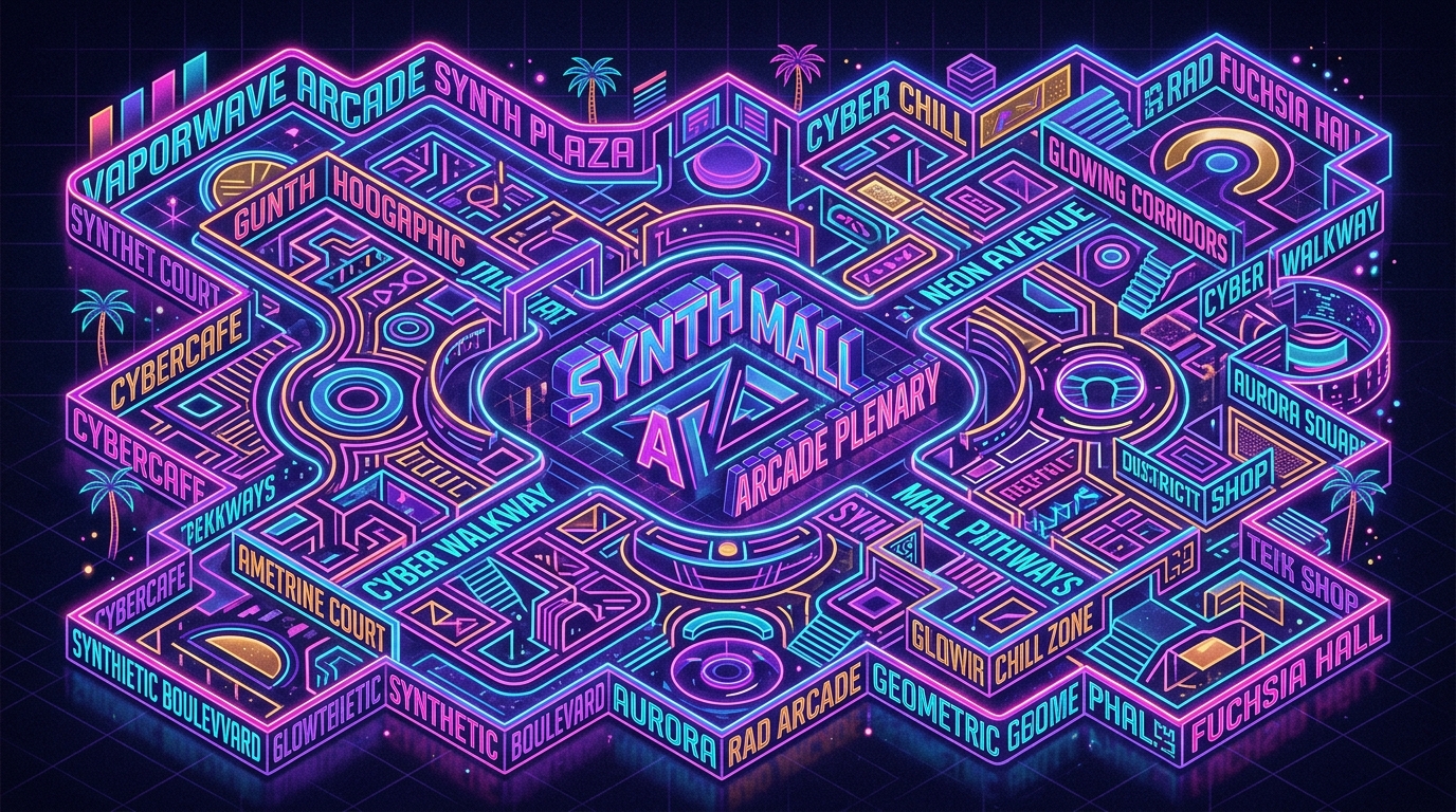
It is a neon-soaked dream where the 80s meets the future in a perfect, high-speed blend. Think of it as the ultimate level-up for wayfinding, combining nostalgic colors with the sleekness of modern tech. This atmosphere is often compared to the ultimate vaporwave vibe that defined the peak of mall culture.