Remember when we all thought the year 2025 would involve flying cars and metallic jumpsuits instead of just endless doom-scrolling? While the jetpacks haven’t arrived yet, the aesthetic definitely has. It is time to trade those boring, “safe” designs for the neon-soaked glory of retro futuristic fonts. We’re officially over that bland minimalism that looked like a doctor’s office waiting room, and we’re heading back to a future where typography is loud, weird, and dripping with synthwave energy.
If you want your brand to look like it belongs on a dusty VHS tape or a high-score screen from 1984, you need those liquid-soft curves and psychedelic serifs. These styles are making a massive comeback because they capture that perfect mix of “I love my analog gear” and “I’m ready for the digital simulation.” It’s time to embrace the funky distortions and glowing grids that make every headline feel like a boss battle in a neon-drenched arcade.
If you want your digital art to look like it stepped out of a neon-soaked 1970s sci-fi flick, you need to embrace the power of the liquid serif. These fonts take those groovy, melting curves from old concert posters and give them a sharp, high-end digital polish that feels totally fresh for 2026. Think of them as the visual equivalent of a lava lamp sitting on top of a high-tech gaming rig. They provide that perfect “melting” sensation that makes your social media headers look expensive and slightly trippy at the same time. You can use these letterforms to break away from the boring, flat designs of the past decade and finally give your brand some actual personality.
Getting that classic laser-grid style right means finding a balance between nostalgic warmth and futuristic edge. When you pair these funky, psychedelic curves with a glowing cyberpunk background, you create a look that screams “renegade hacker from an alternate timeline.” These fonts are designed to flow like water across your screen, making them ideal for everything from vaporwave album covers to flashy twitch overlays. It is all about rejecting that stiff, minimalist vibe and leaning into the beautiful chaos of distorted shapes. Your audience will love the way these letters seem to vibrate with energy, especially when you drench them in pink and purple neon lights.
You do not need to be a professional typographer to realize that curvy, bold letters are making a massive comeback in the world of digital branding. These styles are perfect for when you want your text to feel like a living, breathing part of your futuristic cityscapes rather than just an afterthought. Whether you are designing a new logo or just spicing up your latest graphic, these melting serifs offer a playful nod to the past while looking forward to a high-tech tomorrow. Just imagine your favorite 80s movie titles but with a modern, high-definition twist that pops off the screen. It is time to let your creativity get a little weird and embrace the wavy side of the retro future.

If you want your designs to feel like they were ripped straight out of a 1984 arcade cabinet, you need typography that screams digital rebellion. We are talking about those chunky, pixelated block fonts and slanted scripts that look like they are moving at light speed through a purple nebula. These styles ditch the boring, flat look of the last decade in favor of something that actually has some personality. You can practically hear the synthesized bassline just by looking at a neon-soaked title on a grid background. It is all about capturing that vibe where the future looked like a high-speed chase in a chrome sports car.
Creating that perfect vaporwave aesthetic requires a mix of intentional glitches and smooth, liquid-like curves. You should look for fonts that feature horizontal scan lines or “sliced” effects that mimic a VHS overlay effect for fuzzy playback. Pair these distorted textures with a vibrant pink and cyan color palette to make your text pop against those dark, cyberpunk cityscapes. These fonts do not just sit on the page, they demand attention like a high-score screen flashing in a dark room. Whether you are building a social media header or a new gaming brand, these styles turn a simple word into a full sensory experience.
The best part about this retro-futuristic revival is how it blends old-school nostalgia with modern digital polish. You can take a funky, psychedelic serif from the seventies and hit it with a glowing neon outer glow to create something entirely new for 2026. It is like taking a time machine back to the decade of big hair and even bigger shoulder pads, but with better resolution. Your audience wants to feel that sense of wonder that came from early computer graphics and laser displays. By using these expressive scripts and grid-heavy layouts, you are giving them a one-way ticket to a digital paradise that never truly went out of style.
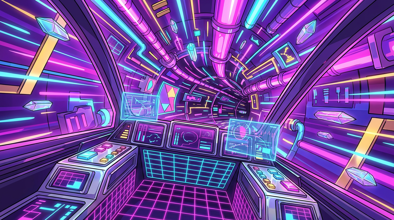
If you want your designs to look like they were pulled straight from a rainy alleyway in 2077, you need to ditch those boring default fonts immediately. Achieving that perfect high-tech low-life vibe is all about finding the sweet spot between cold, robotic precision and the grungy chaos of an underground hacker den. Look for fonts with sharp metallic edges that feel like they could slice through a neon sign or heavy sans-serifs that scream industrial mega-corp. These styles work best when they look a little bit dangerous, like something you would find flickering on a cracked terminal screen in a dystopian basement. You are trying to capture that classic laser-grid energy while making sure your text stays readable enough for your fellow outlaws to find the secret hideout.
Pairing these aggressive letterforms with your neon cityscapes is where the real magic happens for your digital art. Try layering your text with glowing outer shadows or digital glitches to make it pop against those deep purples and electric blues. The trend for 2026 is moving away from boring minimalism and leaning into expressive, distorted shapes that feel both nostalgic and ahead of their time. You can even mix in some funky, liquid-like curves to give your graphics a psychedelic 1970s sci-fi feel that breaks up the rigid grid of the city. Remember that in a world of chrome and circuitry, your typography should feel like a bold statement against the system.
Don’t be afraid to get a little weird with your spacing and colors to really nail that synthwave aesthetic we all love. Stretching your letters or adding some artificial scan lines can instantly transform a simple word into a piece of futuristic propaganda. Think about the classic movie posters and arcade cabinets that fueled your childhood dreams of flying cars and robot sidekicks. By combining these retro futuristic fonts with high-contrast gradients, you can start creating your own visual language that feels fast, loud, and incredibly cool. It is all about embracing the glorious excess of the 80s while keeping one eye firmly fixed on a high-speed digital future.

To truly nail that classic synthwave vibe, you need to stop playing it safe with boring sans-serifs and embrace the glorious chaos of retro-futuristic typography. Start by picking a font that looks like it was ripped straight from a 1984 arcade cabinet or a high-octane sci-fi movie poster. You want those sharp, aggressive angles or those liquid-like, psychedelic curves that scream “I spend my weekends driving a DeLorean through a neon grid.” These fonts act as the backbone of your design, setting the stage for all the glowy goodness you are about to pile on top. Once you have your letters in place, remember that bigger is almost always better when you are aiming for that over-the-top cyberpunk energy.
Giving your text that professional-tier polish is all about layering textures like you are building the ultimate digital lasagna. Throw a vibrant pastel gradient over your letters, blending hot pinks into deep purples to mimic a perpetual digital sunset. To really make it pop, apply a glossy chrome effect or a metallic sheen that makes your typography look like it was forged in a high-tech laboratory. Do not be afraid to add some digital distortion or a subtle scanline overlay to give it that authentic VHS aesthetic. These tiny details are what separate a quick meme from a piece of art that looks like it belongs on a professional synthwave album cover.
Finally, you need to ground your floating neon words by placing them in a world of laser grids and glowing horizons. Use your typography as the centerpiece of a sprawling cyberpunk cityscape, making sure the lighting from your neon signs actually reflects off the chrome edges of your text. You can even experiment with adding a bit of outer glow or a drop shadow in a contrasting neon blue to help the words jump off the screen. It is all about crafting riveting synthwave visuals that capture that specific feeling of a future that never quite happened but looks way cooler than the real one. Just keep it bold, keep it bright, and never let anyone tell you that you have used too much pink.
It is finally time to grab your shades and start downloading these fonts to make your next design project look like a masterpiece from the year 1984. You have all the tools you need to turn a boring blank canvas into a neon soaked dreamscape that would make any cyborg proud. Whether you are building a custom header for your gaming channel or designing a digital poster for a synthwave concert, these typefaces bring that essential laser grid energy. Moving away from the boring minimalism of the past few years is a total vibe shift that lets you embrace your inner digital rebel. Your audience is ready for something that pops against those glowing cityscapes and chrome textures you love.
The blend of funky curves and sharp digital distortions is exactly what you need to stay ahead of the curve in 2026. These fonts do more than just sit there, they practically hum with the sound of an old school synthesizer and look perfect under a heavy layer of scan lines. You can easily mix a chunky seventies serif with a sleek cyberpunk edge to create something that feels both nostalgic and brand new. Do not be afraid to go overboard with the glow effects and purple gradients because more is always more in this aesthetic. Your graphics are about to go from zero to hero faster than a sports car driving into a pixelated sunset.
Now that you have the ultimate toolkit of retro futuristic typography, the digital world is yours to conquer. Every letter you type can now carry the weight of a classic arcade game or a high tech thriller from the VHS era. It is all about capturing that specific feeling of a future that never quite happened but looks incredibly cool anyway. Just remember to keep your designs bold, your colors bright, and your kerning tight enough to fit on a floppy disk. You are officially ready to shut down the mainframe and start creating some legendary visuals that will stand the test of time.
These fonts are the visual equivalent of a 1980s arcade machine having a baby with a high-tech spaceship. They mix nostalgic vibes like neon glows and liquid curves with a sharp digital edge that makes your designs look like a boss battle. It is the perfect way to ditch that boring doctor office minimalism for something that actually has a soul.
People are tired of flat designs that look like they were made by a robot with no sense of humor. These curvy, psychedelic styles capture a mix of analog warmth and digital coolness that feels totally fresh for 2026. They give your brand a personality that screams renegade hacker rather than corporate spreadsheet.
You need to embrace the funky distortions and glowing grids that defined the synthwave era. Pair those melting, liquid-soft curves with high-contrast neon colors to get that perfect 1984 high-score screen aesthetic. It is all about finding the sweet spot between a lava lamp and a high-end gaming rig.
These fonts are perfect for social media headers, digital art, or any project where you want to stand out from the crowd. Use them whenever you want your audience to feel like they are stepping into a neon-soaked sci-fi flick. They work best for headlines that need to grab attention like a laser beam.
Not at all, because the style is meant to be fun and slightly chaotic. Just swap out your safe fonts for something with psychedelic grooves and watch your design transform instantly. As long as you embrace the synthwave energy, you can create something that looks expensive and trippy without much effort.
The secret is pairing those groovy seventies curves with a sharp, high-end digital polish. You want your work to look like it belongs in an alternate timeline where the 80s never ended but the tech kept getting cooler. This balance keeps your design from looking like a basement relic and makes it feel like the actual future.