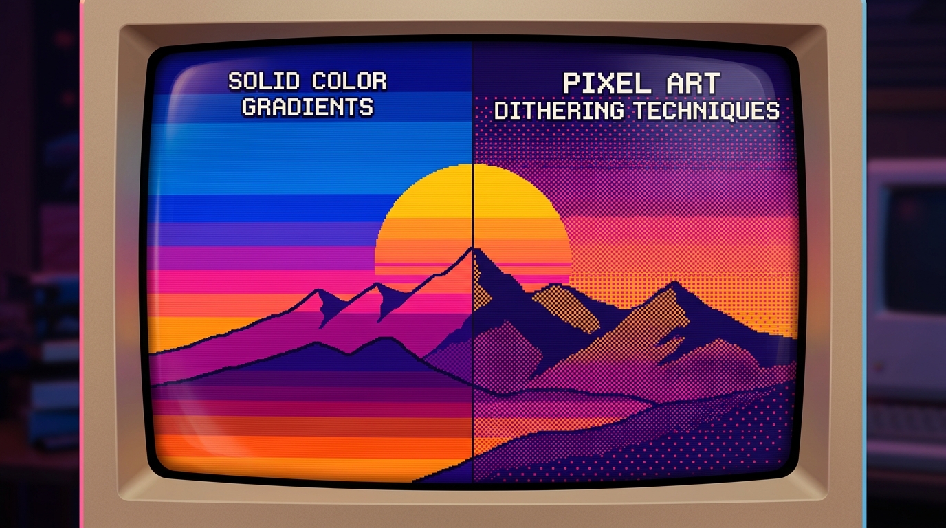
Remember when your favorite handheld console had the processing power of a potato, but the graphics still hit like a neon-soaked dream? Back then, squeezing extra colors out of a tiny screen was a survival skill, but today, mastering pixel art dithering techniques is all about that sweet, sweet lo-fi aesthetic. You aren’t just placing dots; you’re a digital wizard tricking the human eye into seeing gradients that shouldn’t exist. It’s the secret sauce that turns a flat, boring block of color into a moody synthwave sunset or a gritty dungeon wall.
You’re here because you want your sprites to have that crunchy, retro soul without looking like a chaotic mess of digital confetti. Whether you’re chasing that Neo-Nostalgia vibe or just want to make your indie game look like a lost masterpiece from 1989, getting your patterns right is key. From the classic checkerboard to the organized chaos of noise dithering, these old-school tricks are your ticket to style heaven. Embrace the grain and give your art that glorious, low-bit texture that makes every pixel count.
The checkerboard pattern is the absolute king of the 16-bit era, acting as the secret sauce that made 1990s console skies look like a dream. By alternating two colors in a simple 50/50 grid, you can trick the human eye into seeing a brand new shade that technically does not even exist on the screen. It is a total magic trick for your monitor, giving your shadows that crunchy, retro texture that feels like a warm hug from a CRT television. You do not need a fancy graphics card to pull this off, just a love for that classic grid-based math. This technique is perfect for when you want your digital art to feel like a playable piece of synthwave history.
If you want to get a little fancier with your gradients, the checkerboard and Bayer matrix is your new best friend for achieving those smooth, mathematical transitions. Instead of a simple flip-flop, this method uses a structured grid to vary the density of pixels, creating a sophisticated fade that looks incredible in neon-soaked landscapes. It gives your water and sky effects a structured, robotic precision that screams high-end retro computing. You can almost hear the hum of an old disk drive when you see these patterns working their magic on a digital sunset. It is the ultimate tool for any creator looking to capture that specific neo-nostalgia vibe without breaking a sweat.
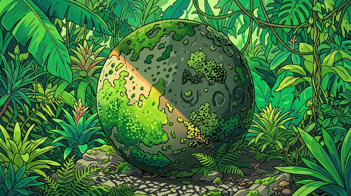
If you want your pixel art to look like a dusty cartridge found in a 1980s basement, you have to stop being so perfect with your patterns. While the classic checkerboard grid is great for a clean sky, it feels way too robotic for the gritty, oil-slicked streets of a cyberpunk dystopia. You should embrace the chaos of organic noise by scattering your pixels like you just dropped a bag of digital flour on the floor. This messy approach breaks up those boring, flat surfaces and gives your textures a crunchy, lo-fi personality that feels lived-in and authentic. It is the secret sauce for making a pile of rocks look like actual debris instead of a weirdly shaded bathroom tile.
Stylized manual clustered dithering is where you really get to play god with your tiny neon squares. Instead of letting a computer algorithm decide where the dots go, you manually group pixels into little islands and jagged clumps to mimic shadows and grime. Think of it like digital stippling that captures the vibe of an old CRT monitor flickering in a rain-soaked alleyway. This technique is perfect for adding that retro rewind aesthetic to your character’s leather jacket or a rusted-out hovercar. You are basically painting with intentional mistakes, and the result is a beautifully textured look that screams synthwave cool without trying too hard.
Mastering this hand-placed grit allows you to guide the player’s eye exactly where you want it to go. By clumping your pixels more densely in the corners and thinning them out toward the light, you create a sense of depth that a rigid grid just cannot match. It gives your art a handcrafted, tactile feeling that makes people want to reach out and touch the screen. Whether you are building a pixelated wasteland or a high-tech city of the future, these irregular patterns provide that delicious visual crunch. Just remember that in the world of neo-nostalgia, a little bit of beautiful mess goes a long way toward making your world feel real.
While basic checkerboard patterns are great for your standard retro sky, you need to level up your game if you want that wood grain or flowing cape to actually look like it is moving. Hatching and stripe techniques are the secret sauce for adding direction and energy to your static sprites without needing a million colors. By laying down rows of pixels in specific paths, you can guide the viewer’s eye along the curves of a neon-drenched leather jacket or the rugged texture of a sci-fi log cabin. It is all about creating a rhythmic flow that makes your art feel like it is vibrating right off the screen. This method turns those crunchy, low-res limitations into a deliberate style choice that screams high-effort craftsmanship.
Think of these directional lines as the digital equivalent of a 1980s comic book artist using ink to shade a hero’s billowing cape. Instead of just plopping down random noise, you are weaving a tapestry of pixels that implies weight and gravity. If you are designing a character dashing through a rain-slicked cyberpunk alley, diagonal stripes can simulate motion blur and speed. You can even vary the thickness of these lines to show where the light from a nearby arcade cabinet is hitting the fabric. It is a fantastic way to add personality to your textures without making the canvas look like a cluttered mess of random dots.
Mastering these woven patterns allows you to ditch the boring flat looks of the past for something that feels alive and tactile. You can mix different stripe densities to create a sense of depth, making your 2D world feel like a place you could actually step into. Whether you are aiming for a gritty retro-future vibe or a cozy pixelated forest, these directional strokes give your work that polished, professional edge. Just remember to keep your lines consistent with the shape of the object so your textures do not end up looking like a glitchy mess. Once you get the hang of it, you will be creating flowing masterpieces that would make any old-school computer graphics wizard proud.
Mastering the art of the pixel is about more than just placing blocks, it is about capturing that sweet, crunchy vibe that defined an entire era of gaming. Even though your modern computer can display millions of colors, there is something incredibly satisfying about forcing it to act like a vintage machine from 1989. By using checkerboard patterns and bayer matrices, you can turn a flat image into a textured masterpiece that feels like it belongs on a dusty floppy disk. It is the ultimate way to bridge the gap between high-tech tools and that classic lo-fi soul we all crave. This technique allows you to create depth and shadows without losing that pixel art aesthetic that makes pixel art stand out in a sea of blurry digital paintings.
You do not need a time machine to bring these retro textures into your current projects, you just need a little patience and a love for neon-soaked visuals. Whether you are aiming for a gritty cyberpunk cityscape or a peaceful synthwave sunset, dithering gives your work that authentic, hand-crafted feel. It is like adding a layer of digital static that makes everything look more tangible and lived-in. Grab your digital stylus and start blending those colors to give your modern art a glorious lo-fi soul that would make any arcade dweller proud. Your journey into the world of neo-nostalgia is just beginning, so keep those pixels clicking and your gradients crunchy.
Dithering is your secret weapon for tricking the human eye into seeing colors and gradients that are not actually there. It gives your art that crunchy, retro soul and keeps your sprites from looking like boring blocks of flat color. Think of it as digital magic that turns a potato-powered screen into a neon masterpiece.
You just need to alternate two colors in a simple 50/50 grid to create a brand new shade. This legendary 16-bit trick is perfect for making shadows feel like a warm hug from an old CRT television. It is the easiest way to give your game that sweet, playable synthwave history vibe.
The Bayer matrix is the fancy, mathematical cousin of the checkerboard that helps you create super smooth gradients. It uses organized patterns to transition between colors without looking like a chaotic mess of pixels. Use this when you want your digital art to look like a high-end lost masterpiece from 1989.
Absolutely, because mastering these patterns is the fastest way to achieve that glorious low-bit texture players crave. It adds a layer of Neo-Nostalgia that makes every single pixel count toward a specific aesthetic. Your game will go from looking like a basic sketch to a gritty, moody dungeon crawl in no time.
You can experiment with noise dithering to create a sense of organized chaos in your textures. This technique breaks up the rigid math of the checkerboard and adds a gritty, organic feel to your work. It is the best choice for when you want your world to feel lived-in and slightly mysterious.
You do not need a fancy graphics card or a supercomputer to become a dithering wizard. These tricks were born from a time when consoles had the processing power of a literal potato. All you need is a love for the grid and the patience to place your dots with style. Even today, many artists still celebrate the glorious potato quality of early digital imaging as a unique form of expression.