Retrofuturist space station design started with a spinning doughnut. In 1929, Hermann Noordung sketched a doughnut-shaped habitat wheel that rode alongside a giant sunlight-collecting mirror, and that ring still looks like the poster child for life in orbit. It’s the kind of shape you’d expect to see glowing on a synthwave album cover.
Wernher von Braun went even bigger. His 1952 concept was a 250-foot-wide wheel that would orbit 1,075 miles above Earth and house 80 people, spinning to create artificial gravity. Over time, though, designers traded spin for simpler weightless labs, and the sleek command decks we picture today grew out of that shift.
The spinning space wheel traces back to Hermann Noordung, who drew up a space station in 1929 with a doughnut-shaped habitat ring at its heart. The wheel was the star of the design, but it wasn’t the whole show. Noordung also gave the station a large concave mirror that would gather sunlight and turn it into power, so the station ran on light the way a retro arcade cabinet runs on quarters.
Noordung didn’t cram everything into one ring, either. He kept an observatory and a machine room as separate components, set apart from the habitat. Imagine a neon-lit lineup of modules, each with its own job, floating together like a sci-fi poster that couldn’t decide on one shape.
Wernher von Braun later took the wheel idea and made it bigger. His 1952 concept measured 250 feet across and was meant to orbit 1,075 miles above Earth. The wheel would house 80 people, and its steady spin would create artificial gravity, so crew members would feel a floor under their feet instead of drifting around like loose change in a pocket.
The idea reached a wide audience through Collier’s, where von Braun and other contributors predicted the station could be built by 1967 for $4 billion in 1952 dollars. NASA’s history of space stations records that optimistic timeline, which makes the picture even more charming. The future looked close, and the wheel looked like the obvious way to get there.
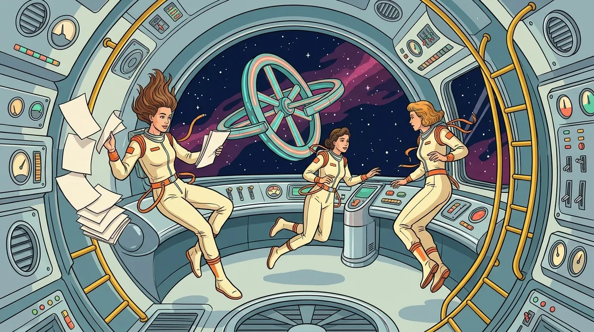
In 1962, NASA decided that simpler weightless labs made more sense than spinning wheels. A NASA space-station study statement dated December 15, 1962 called for no artificial gravity and for making the most of launch vehicles and spacecraft systems that already existed. In plain terms, why build a giant spinning ring from scratch when you can reuse hardware you already have?
That practical choice pushed designers toward stations built for work. Instead of chasing the Earth-like feel of a rotating floor, they focused on lab space, experiments, and getting crews through their days safely. It was less glamorous than a wheel, but it was far easier to get off the ground.
Skylab was the proof. Engineers built it from a converted Saturn rocket stage that measured 7 meters across and 39 meters long. Inside, it offered about 480 cubic meters of habitable volume, enough room for a crew to stretch out, float around, and pretend they were starring in a retro sci-fi movie.
Even without gravity, the crew needed a sense of direction. Skylab’s interior established a “local vertical”, so people could tell which way was up even though nothing pulled them toward a floor. Designers arranged the space so the lab made sense to the eye, which is a neat trick when your coffee drifts off in a loop.
The International Space Station carried the practical path forward. Rather than one huge wheel, it grew by connecting modules over time, adding new pieces as needed. The result looks less like a single glowing doughnut and more like a neon-lit Lego set that keeps getting new bricks. It may not spin, but it still delivers plenty of cosmic style.
Movies made station interiors feel real by building them, spinning them, and letting audiences watch people live inside them. The biggest example is 2001: A Space Odyssey, which used a rotating set to show life and work inside a spinning spacecraft. Instead of imagining a floor that curves up around you, viewers could watch characters walk, sit, and move through rooms that actually turned.
The engine behind that illusion was a 30-ton rotating centrifuge built by Vickers-Armstrong. It measured 38 feet across, roughly the size of a backyard swimming pool, and it spun the set so the actors could move through a convincing sense of gravity. The 2001 Archive reports that the centrifuge cost $750,000, a serious sum even by Hollywood standards.
The look that came out of the film stuck around. Corridors curve gently, walls stay clean and white, and the rooms feel calm and bright. Fans still love that tidy, almost polished style, and it became a visual shorthand for the future.
Synthwave artists and 80s sci-fi illustrators borrowed that clean geometry and gave it a glow. Imagine a curved white hallway lit up in hot pink and electric cyan, with a neon grid running along the floor. It’s a surprisingly good match, like a sterile lab that somehow got wired to an arcade cabinet.
Those film sets gave later designers a picture to aim for. Every time a retro poster shows a glowing, curved corridor, it carries a bit of that movie idea with it, still humming along decades later.
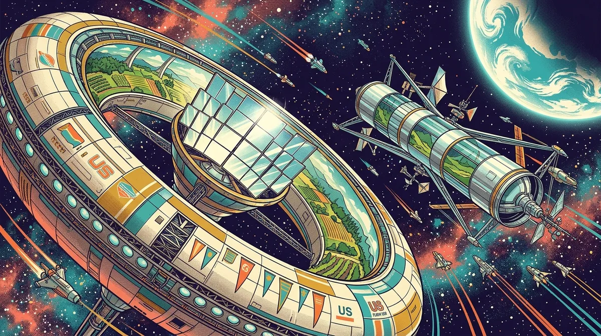
NASA’s 1975 space-settlement study imagined permanent orbital communities for up to 10,000 people, which was a huge jump from a single crew cabin. The study ran for 10 weeks, and it reads like a city planning session held in zero gravity.
The best-known design from that work was the Stanford torus. It was 1.8 kilometers across and rotated once per minute to produce about 1 g at its habitat rim. Living there would have meant walking on a curved floor while the stars wheeled past the windows. The slow spin kept the center near weightlessness, so the ring worked like a rotating hub with a view.
Artists loved that scale. Retro sci-fi cityscapes often showed clusters of habitat rings hanging over a glowing planet, with neon-lit walkways curving into a starry sky. Chesley Bonestell, the painter famous for his space scenes, helped fix that big-picture look in people’s minds.
Synthwave covers borrow the same mood. Imagine a massive ring floating above a purple horizon, with a sunset gradient in the background and a grid stretching across the foreground. It’s the kind of image that makes you want to turn up the volume and stare out the window at a fictional station for a while.
Modern designers are finding ways to bring back spin without making the whole station turn. Some want a habitat that unfolds in orbit, while others want a steady hub with modules that circle around it.
NASA’s deployable-habitat concept imagines a structure that could expand to one kilometer or more once it reaches orbit, far bigger than anything a rocket could carry in one piece. The design would spin at 1 to 2 rpm, a gentle pace that still provides about 1 g at its ends.
The center of that structure would sit close to the spin axis, where the pull is too weak to feel like gravity. Crews could walk along the outer edges as if they were on a floor, then drift toward the middle to work on experiments. It’s like a giant neon hamster wheel where the hamster can float to the center whenever it wants.
A different approach shows up in a NASA Ames artificial-gravity patent. It describes a stationary spacecraft connected to modules that travel in a circular path to create gravity. The station itself never has to spin, so the central craft stays calm while the outer modules do all the moving.
Both ideas keep the old wheel’s promise of an Earth-like floor, but they change how the motion happens. For retro fans, it’s like the classic poster finally got a sequel with better engineering.
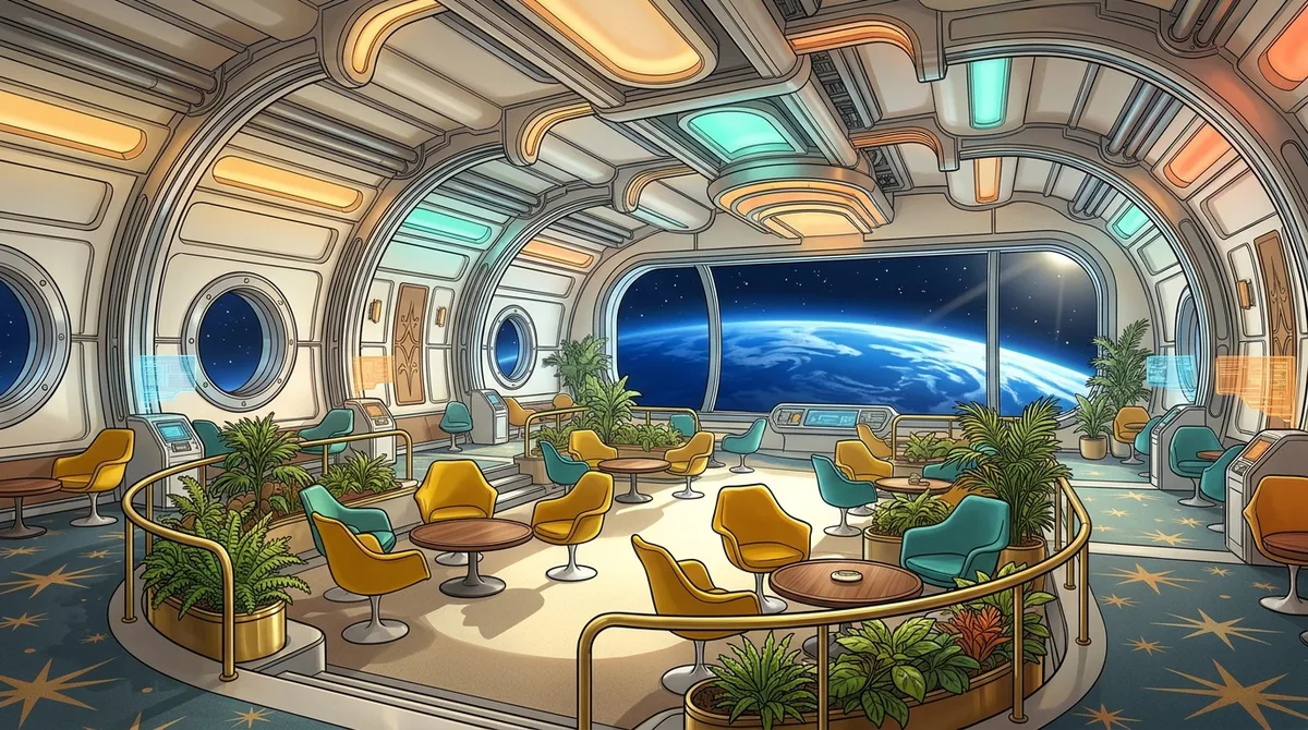
Inside a modern commercial space station, the goal is a place where people can actually live, not just survive. Vast’s October 2024 announcement of its final Haven-1 design shows what that looks like. The interior puts crew comfort, privacy, and views of Earth front and center.
The shared heart of the station is a common area of 24 cubic meters. It’s the lounge zone where the crew can eat, chat, and unwind together, a long way from the all-business feel of early labs.
The standout feature is a 1.1-meter domed window. Imagine Earth rolling past a big curved glass bubble, with the planet’s glow washing over the room like a synthwave sunset. For a crew living in orbit, that view is a real morale booster.
Privacy gets equal attention. Four private crew quarters give each person a place to step away, sleep, or simply stare at the wall for a while. That matters when you’re sharing a small metal can with your coworkers.
That shift from pure lab work to crew comfort is the big story in commercial design. Newer concepts treat living space as seriously as experiments, so the station feels less like a spaceship and more like a sleek, glowing apartment that happens to orbit the planet.
A 2026 peer-reviewed study from TU Wien rebuilt Hermann Noordung’s station from its original drawings. The team first made a digital model, then turned it into a 3D-printed physical prototype, so the 1929 design could be studied on a screen and in your hands.
The goal was to reassess the station’s spatial layout and interior architecture. That means looking at how the rooms fit together, how much space each part gets, and how a crew would move between the habitat ring and the separate observatory and machine room. A design can look perfect as a sketch and still feel cramped once it has real floors and walls.
It’s a fresh look at a design that is nearly a century old, and that’s part of the fun. Artists have been borrowing Noordung’s doughnut for decades, and now researchers are handling it like a model kit that finally came with instructions. Every corner of the 3D print is a reminder that the original vision was more than a pretty poster.

Choosing the right tee is the last step between you and a glowing space wheel on your chest. Retrowave’s standard unisex graphic tees share a few key traits:
Before you buy, check the size chart on each product page. Because these tees run true to size, your usual size should fit. The light fabric also keeps things comfortable during a long arcade marathon or a hot summer convention.
Want a full-coverage starfield instead? The Blue Rays AOP tee is 100% polyester with a regular fit and no tag at all. It comes in 4.0 oz and 6.0 oz fabrics, so you can pick the lighter option for warm days or the heavier one for a sturdier feel. It also runs true to size, so use the size chart as usual.
Standard graphic tees are listed at $27.00 and are often on sale at $22.95, so watch for those markdowns. If a shirt doesn’t suit you, returns are accepted within 30 days of receipt for most items in new condition. Custom orders may take longer to ship than standard ones, so order early if you need your tee by a certain date.
Start with your budget. Standard graphic tees are often on sale at $22.95, and some tees are listed at $11.99, or $10.19 on sale, which is a cheap way to try a space-wheel design. Ready to launch? Head to retrowave.com and browse the lineup. If you want a full starfield across your chest, AOP shirts are listed at $32.00 and sit at $27.20 on sale.
Checkout accepts Visa, MasterCard, American Express, PayPal, and other digital payment platforms. Once you order, a confirmation email lands in your inbox, so check your size and design right away. Need a change? Order changes or cancellations are possible only within a short window and must go through customer service, so act fast because they may not be possible once the order is processed.
Shipping reaches most countries, but costs and delivery times depend on your destination, so look those up before you hit buy. Sign up for the newsletter too, since it announces special offers and new arrivals before the good stuff sells out. After your tee arrives, leave a review on the product page to help the next fan choose.
Reach out through the Contact Us page or by email to round out your retro mission.