Remember that feeling of standing in front of a giant, faded board at the food court, squinting at a “You Are Here” sticker that was definitely lying to you? Those days of getting lost between the arcade and the neon-soaked sneaker store are getting a major 16-bit upgrade. Modern mall map design has officially entered its final boss form, ditching the flat, confusing sketches for high-tech digital systems that feel like navigating a level in a futuristic RPG.
We’re talking silky-smooth 3D interfaces that make finding the fountain or the pizza place feel like a quest reward rather than a chore. New research shows that placing landmark icons right where you need them keeps your stress levels low and your shopping stamina high. It’s all about that vaporwave aesthetic meeting peak efficiency, ensuring you spend less time wandering in circles and more time living your best life under the glow of the neon lights.
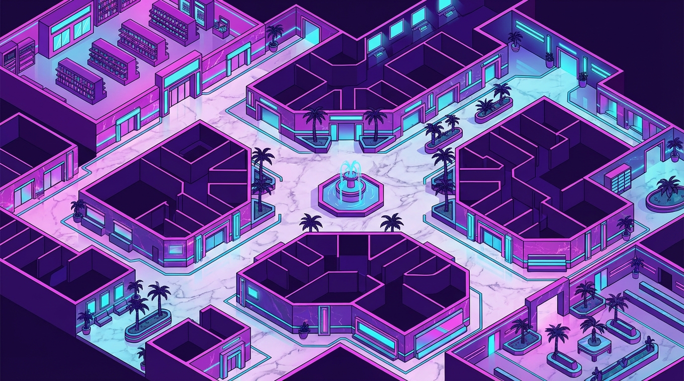
Step into a world where finding the food court feels like a high-stakes mission in a retro arcade game. Back in the day, mall maps weren’t just boring pieces of paper, but were instead vibrant masterpieces of neon cartography that looked like they belonged on the cover of a synthwave album. You would stand in front of a giant backlit directory, staring at electric blues and hot pinks that turned a simple floor plan into a glowing piece of futuristic art. These layouts used bold geometric shapes to guide you through a maze of glass elevators and indoor fountains. It was less about getting lost and more about soaking in that sweet outrun aesthetic while hunting for a new pair of high-tops.
Designers in the eighties knew that a map was the ultimate vibe check for the entire shopping experience. By using high-contrast colors and sharp angles, they created a visual language that felt like stepping inside a computer grid from a classic sci-fi flick. Even if you were just looking for the nearest toy store, the glowing lines and grid patterns made you feel like a digital explorer navigating a neon-lit frontier. This style transformed a functional tool into a core part of the retail atmosphere, proving that even a directory could be a total mood. Today, this retro look is making a huge comeback because it taps into that perfect mix of nostalgia and futuristic energy.
While modern maps are getting fancy with 3D interfaces and digital screens, they still owe a huge debt to these old-school neon blueprints. Those classic layouts proved that visual clarity works best when it has a little bit of personality and a whole lot of glow. When you see a map that uses landmarks like a giant neon clock or a stylized palm tree, you are seeing the roots of great wayfinding design. It is all about making the journey through the mall feel like an adventure rather than a chore. Whether you are a gamer or just a fan of that classic 1984 aesthetic, there is no denying that these electric floor plans are still the gold standard for cool. Designers often paired these grids with retro futuristic fonts to complete the high-tech atmosphere.

The “You Are Here” red dot is the true north of the neon-drenched mall universe, sitting right at the heart of a massive aluminum and plexiglass monolith. You stand there, bathed in the hum of fluorescent lights, staring at a grid of pastel shapes that represent the ultimate retail playground. It is not just a sticker on a map, but a glowing beacon of hope when you are lost between the food court and the arcade. This tiny crimson circle is the original save point of the physical world, telling you exactly where your journey begins. Without it, you would just be a wanderer lost in a sea of palm trees and glass elevators.
Navigating these sprawling labyrinths required a specific kind of 80s logic that modern GPS just cannot replicate. You have to squint at the colorful legend to find the department store anchors, all while the map itself looks like it was plucked straight from a low-poly video game. The design usually features bold lines and high-contrast colors that scream aesthetic, making every trip to the mall feel like a mission in a synthwave movie. Designers knew that if you could find that red dot, you could find anything from a new cassette tape to a fresh pair of high-tops. It served as the ultimate landmark, standing tall near the central fountain like a silent, glowing guardian.
Today, we see these classic layouts evolving into slick 3D digital interfaces that feel like something out of a sci-fi cockpit. While the old-school physical stands are becoming vintage relics, their influence on modern mall navigation and how we move through space is still legendary. Modern research shows that we actually navigate better when we have clear landmarks and 3D visuals to guide us through multi-level floors. Even as we move toward high-tech screens, that nostalgic red dot remains the most iconic UI element in history. It taught an entire generation how to read a map while holding a soft pretzel and dodging mall security.
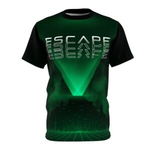
Step into the glow of those massive, backlit plastic monoliths that used to stand guard at every corridor intersection. You remember the vibe, where chunky, blocky fonts screamed at you in all-caps like a low-resolution computer from a sci-fi flick. These directories werent just maps, they were neon-soaked portals that made finding a pretzel stand feel like a mission in a cyberpunk dystopia. The typography had that thick, geometric weight that made every store name look like a high-score entry on an arcade cabinet. It was a peak aesthetic era where even a list of shoe stores felt like a transmission from a distant, cooler galaxy.
Each directory panel acted like a literal light box, casting a soft hum and a warm radioactive haze over your denim jacket. The way the light bled through the translucent plastic gave the blues and pinks a dreamy, vaporwave aesthetic quality that modern touchscreens just can’t replicate. You would press your face close to the warm surface, tracing your finger along grid lines that looked more like a circuit board than a floor plan. These maps didn’t just tell you where the food court was, they sold you on a retro-futuristic vision of the world. It was a glorious time when analog design and radical branding turned a simple trip for socks into an immersive outrun adventure.
As you step back into the digital sunset, it is clear that those glowing neon directories were never just about finding the food court. They were the original open-world maps, guiding you through a grid of synthwave dreams and chrome-tiled hallways. Even as we move into a future of high-tech 3D interfaces, that specific 80s aesthetic remains the ultimate vibe for anyone who loves a good retro aesthetic. You can still feel the hum of the fluorescent lights and the static of the CRT screens every time you look at those bold, geometric layouts. It is a visual language that speaks to our collective love for a simpler, more colorful time in retail history.
Modern design might be getting smarter with landmark placements and multi-level 3D views, but the soul of the mall map still lives in that outrun glow. These nostalgic designs rule our dreams because they represent a perfect mix of utility and pure, unadulterated style. Whether you are a gamer chasing a high score or a fan of lo-fi beats, these maps serve as a blueprint for a world where every corner holds a new discovery. They remind us that getting lost in the mall was half the fun, especially when the directory looked like it belonged on the deck of a starship. As we embrace the phygital future, we keep these neon memories close to our hearts for every pixelated journey ahead, often accompanied by the mallsoft aesthetic music that defined the era.
Modern design uses 3D interfaces and RPG style layouts to make your shopping trip feel like an epic quest. These silky smooth graphics replace confusing flat sketches so you can navigate the mall with the same ease as a futuristic open world game.
High contrast electric blues and hot pinks create a visual vibe check that makes the floor plan pop. These bold aesthetics turn a boring directory into a piece of synthwave art that is actually easy to read while you are hunting for new sneakers.
Placing recognizable icons at key points keeps your stress levels low and your shopping stamina high. Instead of wandering in circles, you can use these digital landmarks to claim your pizza reward without getting lost in the neon maze.
Digital mapping systems have defeated the final boss of lying stickers by providing real time accuracy. You get a high tech upgrade that ensures your actual location matches the screen, saving you from the frustration of faded boards.
A map that looks like a classic sci-fi grid improves your overall mood and keeps you energized. When the layout feels like a fun retro arcade mission, you spend less time being frustrated and more time enjoying the glow of the mall.
The new digital grids are designed to guide you through every corner of the mall, from the arcade to the sneaker shop. You can use the high tech search features to plot a direct path to your favorite nostalgic spots without breaking a sweat.