Ever feel like you’re trapped in a glitchy simulation where every cereal box looks like a boring tech startup logo? You’re not alone, and that’s why everyone is currently obsessed with vintage grocery store packaging that looks like it was plucked straight from a neon-soaked 1985 convenience store. With the market for these retro vibes projected to hit a massive $22.53 billion by 2035, your favorite snacks are officially getting a glow-up that feels like a high-score screen on an old arcade cabinet.
Whether you actually remember the eighties or you’re just a fan of that sweet synthwave aesthetic, these tactile, old-school designs are winning the game. Gen Z and Millennials are leading the charge, proving that you don’t need a literal time machine to crave a more authentic, “analog” shopping experience. It turns out that slapping some bold colors and funky fonts on a tin can makes us all feel 15 points happier, which is basically the ultimate power-up for your pantry.
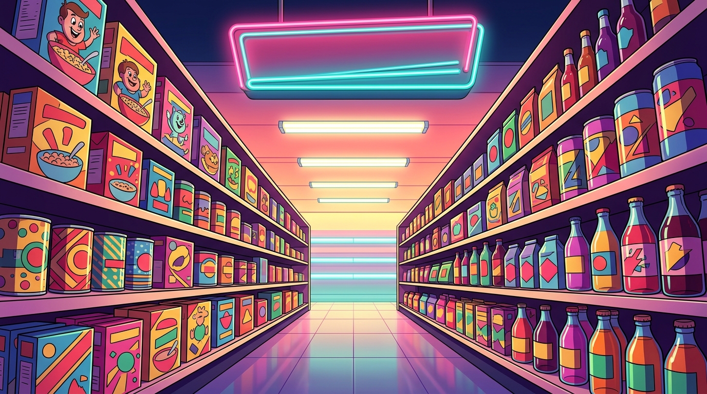
Step into a time machine where the grocery aisles look like a high speed chase through a neon soaked synthwave dream. During the eighties, your average cereal box or soda can wasn’t just a container, it was a loud and proud masterpiece of consumerist pop art. Every shelf was packed with high energy designs featuring electric blues, hot pinks, and radioactive greens that felt like they were vibrating. You could practically hear the guitar solo just by looking at a box of fruity pebbles or a radical can of lemon lime soda. These designs didn’t just ask for your attention, they demanded it with a level of confidence that only a decade of hair spray and arcade games could provide.
The secret sauce of this era was the chunky and unapologetic typography that defined every brand name on the market. Designers ditched the subtle looks for bold, blocky fonts that looked like they were carved out of solid neon or inspired by your favorite Saturday morning cartoon. You will notice how these letters often featured heavy shadows or 3D effects to make the product pop right off the cardboard. It was a glorious era of maximalism where more was always better and nothing was ever too bright. Today, this aesthetic is the ultimate eye candy for anyone who wants to capture that retro vibe in their own space.
Even if you were not around to see these vibrant packages in person, you probably feel a strange sense of longing for this pixel perfect past. This feeling of new nostalgia is why these vintage looks are making a massive comeback in the modern market. Gen Z and Millennials are leading the charge by turning these old school grocery graphics into a lifestyle choice that celebrates the tactile feel of the eighties. Whether it is a classic soda logo or a mascot with way too much energy, these designs represent a fun and simple time. Embracing this bold style is the best way to add a little bit of retro magic to your everyday routine.

You might think your sudden urge to buy a box of cereal because it looks like a prop from an 80s sitcom is just a quirk, but it is actually a multi-billion dollar trend. Gen Z is currently leading the charge into anemoia, which is that weirdly specific feeling of missing a decade you were not even alive to see. Brands are tapping into this by ditching sleek modernism for the loud, proud, and slightly chaotic energy of a retro corner store. By 2035, this market for throwbacks is expected to hit over twenty-two billion dollars as we all chase those warm and fuzzy feelings. It turns out that neon colors and bold typography are the ultimate cheat codes for getting you to hit the checkout button.
Walking down the grocery aisle today feels a lot like entering a glitch in the matrix where the 1950s and 1980s have merged into one aesthetic playground. Companies are swapping out boring corporate logos for bright pastel tones and those iconic “price slash” stickers that look like they were slapped on by hand. This style is a total vibe for anyone who loves synthwave visuals or the high-contrast look of old school pop art. It is less about the actual product and more about capturing a consumerist dream world that feels way more fun than our current digital reality. These designs make everyday items feel like rare loot drops, turning a simple trip to the store into a nostalgic quest for the perfect aesthetic.
The secret sauce behind these massive sales numbers is how these retro looks trigger an instant emotional connection. Research shows that when a package looks like something from a classic movie or an old arcade, people actually enjoy the brand fifteen points more than usual. You do not need to be a marketing genius to see why bold fonts and funky patterns are winning over the internet and your wallet. It is all about that tactile, authentic feel that makes a bag of chips look like a piece of collectible art. Whether you are a hardcore gamer or just a fan of neon lights, these vintage soda cans and vibes are making the grocery store the coolest place to be.
Step into a time machine where the grocery aisles are glowing with neon pinks and electric blues that would make a synthwave producer weep with joy. You are no longer looking at boring, flat plastic wraps but instead encountering bold pop art explosions that feel like they leaped straight out of a 1980s Saturday morning cartoon. This modern take on heritage design swaps out the beige drabness of the past for high energy typography and vibrant color palettes that scream consumerist fun. It is all about that high contrast look where every cereal box and soda can feels like a collectible power up from your favorite retro arcade game. By blending these loud visuals with 21st century printing tech, brands are creating a vibe that is less about your grandma’s pantry and more about a futuristic mall aesthetic.
The real magic happens when you actually pick these items up and realize they feel as cool as they look. Forget that flimsy, crinkly plastic because today’s vintage inspired packaging uses embossed motifs and heavy, tactile cardstock to give you a premium grip. It is the packaging equivalent of switching from a laggy touchscreen back to a mechanical keyboard with that perfect, clicky feedback. These designs use clever alt history layouts to make you feel like you are living in a cooler version of 1985 where everything was designed by a graphic novelist. You get all the soul of a mid century utilitarian shop but with the polished, high definition finish of a modern masterpiece.
This massive shift toward nostalgic aesthetics is not just a fluke, as the market for these retro vibes is projected to hit over twenty two billion dollars by 2035. You are part of a growing crowd of Gen Z and Millennial shoppers who are chasing that sweet feeling of anemoia, which is basically just being homesick for an era you only saw in movies. Even if you never actually lived through the eighties grocery aisles and the age of VHS tapes and neon diners, these tactile packages let you hold a piece of that history in your hands. It turns a boring trip to the store into a quest for the ultimate aesthetic loot drop. Choosing a product with a bold, 80s inspired layout makes your kitchen look like a curated set piece from a sci fi flick.
Stepping out of the time machine and back into the modern grocery aisle feels a bit like switching from a neon-soaked synthwave dream to a dull gray spreadsheet. We have spent so long obsessing over minimalism that we forgot how much fun it is to see the neon glow of retro grocery store aesthetics that actually try to grab your attention with bold typography and electric colors. The massive resurgence of this aesthetic proves that we are all ready to trade those boring, plain labels for the high-energy pop art of the 80s. It is not just about missing the past, but about wanting our pantries to look like a vibrant scene from a classic Saturday morning cartoon.
The future of your shopping cart is looking bright, loud, and gloriously cluttered with heritage vibes that make every snack feel like a collector’s item. Designers are finally leaning into the beautiful chaos of maximalism, ditching the “sad beige” look for primary colors and chunky fonts that scream with personality. Whether you are a gamer looking for that retro pixel-perfect aesthetic or just someone who appreciates a cool bottle, this shift is all about making the mundane feel like a total vibe. It is time to embrace the colorful history of the supermarket shelf and enjoy the neon glory of 80s snacks and the fact that great design never really goes out of style.
You are witnessing a massive glitch in the matrix where everyone wants to escape boring modern logos for something with actual soul. These designs act like a high score for your eyeballs, offering a hit of pure neon nostalgia that makes your pantry look like a level from a classic arcade game.
Gen Z and Millennials are the main players leading the charge back to the analog era. You do not need a time machine to appreciate these vibes, as younger shoppers are trading sleek tech aesthetics for the bold and chunky looks of the eighties.
The secret is in the high energy pop art style that uses electric blues, hot pinks, and radioactive greens. These designs do not play it safe with subtle colors, instead they demand your attention like a loud guitar solo in a synthwave dream.
The market for these old school vibes is projected to hit a massive 22.53 billion dollars by 2035. Your favorite snacks are officially getting a glow up that proves vintage style is a serious power up for the retail world.
Designers back then loved chunky and unapologetic typography that looked like it was carved out of solid neon. These bold and blocky fonts were the ultimate flex, making every brand name look like the title screen of a legendary 16 bit adventure.
It absolutely does because those bold colors and funky fonts are scientifically proven to make you feel about 15 points happier. Surrounding yourself with these tactile and authentic designs is the easiest way to give your daily shopping routine a much needed level up.