You’re ready to turn your space into a lo-fi synthwave dream, but one wrong move can turn your aesthetic masterpiece into a total “Game Over” screen. Avoiding common custom neon sign mistakes is the difference between a glow-up that slays and a flickering mess that looks like a glitch in the Matrix. Whether you’re chasing that 80s arcade vibe or a sleek modern look, you don’t want your big reveal to be a tiny, unreadable blur that literally nobody can see.
Think of your sign like a final boss battle; you need the right strategy to win without wasting your hard-earned gold. From picking “invisible” colors that disappear into the shadows to choosing a size that looks like a thumbnail on a massive wall, the pitfalls are real. It is time to level up your design game and make sure your neon stays bright enough to guide a DeLorean back to the future.
Imagine you are staring at your computer screen, feeling like a total boss because you just designed a custom neon sign that looks absolutely legendary in your browser window. You hit order on that twelve inch masterpiece, picturing it as the glowing centerpiece of your gaming den or storefront, only to have it arrive looking like a tiny, glowing postage stamp. This is the classic Paper Scale Problem, a total final boss move that catches rookie decorators off guard every single time. What looks like a massive, room filling light on your laptop screen suddenly shrinks into a pixelated disappointment once it is mounted on a wide, empty wall. It is like trying to play an epic open world RPG on a tiny handheld screen when you were expecting a sixty inch plasma experience.
To avoid this aesthetic game over, you need to think about your viewing distance before you commit to a size. A solid rule of thumb is to aim for at least one inch of letter height for every ten feet of viewing distance rule from where people will actually be looking. If your sign is tucked away in the corner like a hidden Easter egg, nobody is going to appreciate that sweet synthwave glow you worked so hard to create. You want your neon to pop like a high score on a retro arcade cabinet, not vanish into the background noise of your decor. Always grab a measuring tape and physically mark out the dimensions on your wall with some low profile tape before you buy. This simple reality check ensures your vibe stays legendary and your sign actually gets the main character energy it deserves.

Choosing the wrong color combo for your custom neon is the ultimate “low battery” move for your room’s aesthetic. You might think pairing a deep navy blue with a dark charcoal wall looks moody and mysterious, but in reality, your sign will just vanish into the void like a glitched character in a retro RPG. Without enough contrast, your expensive custom design becomes a blurry smudge that strains the eyes instead of a glowing centerpiece. It is like trying to play a classic Game Boy without a worm light, you know something cool is happening, but you just cannot see it. To avoid this total game over, you need to think about how light interacts with your background to ensure your message actually pops.
High contrast is the golden rule if you want your space to feel like a high-score screen at the local arcade. Pairing bright white or electric yellow against a dark accent wall creates that crisp, punchy look that defines the synthwave aesthetic. If your walls are light, go for bold high-contrast color combinations like hot pink or deep teal to make sure your brand or favorite quote stands out from across the room. Remember that a sign that blends into the background is just an expensive nightlight that nobody can read. By choosing colors that sit on opposite ends of the brightness scale, you guarantee your vibe stays legendary and your investment actually gets noticed.
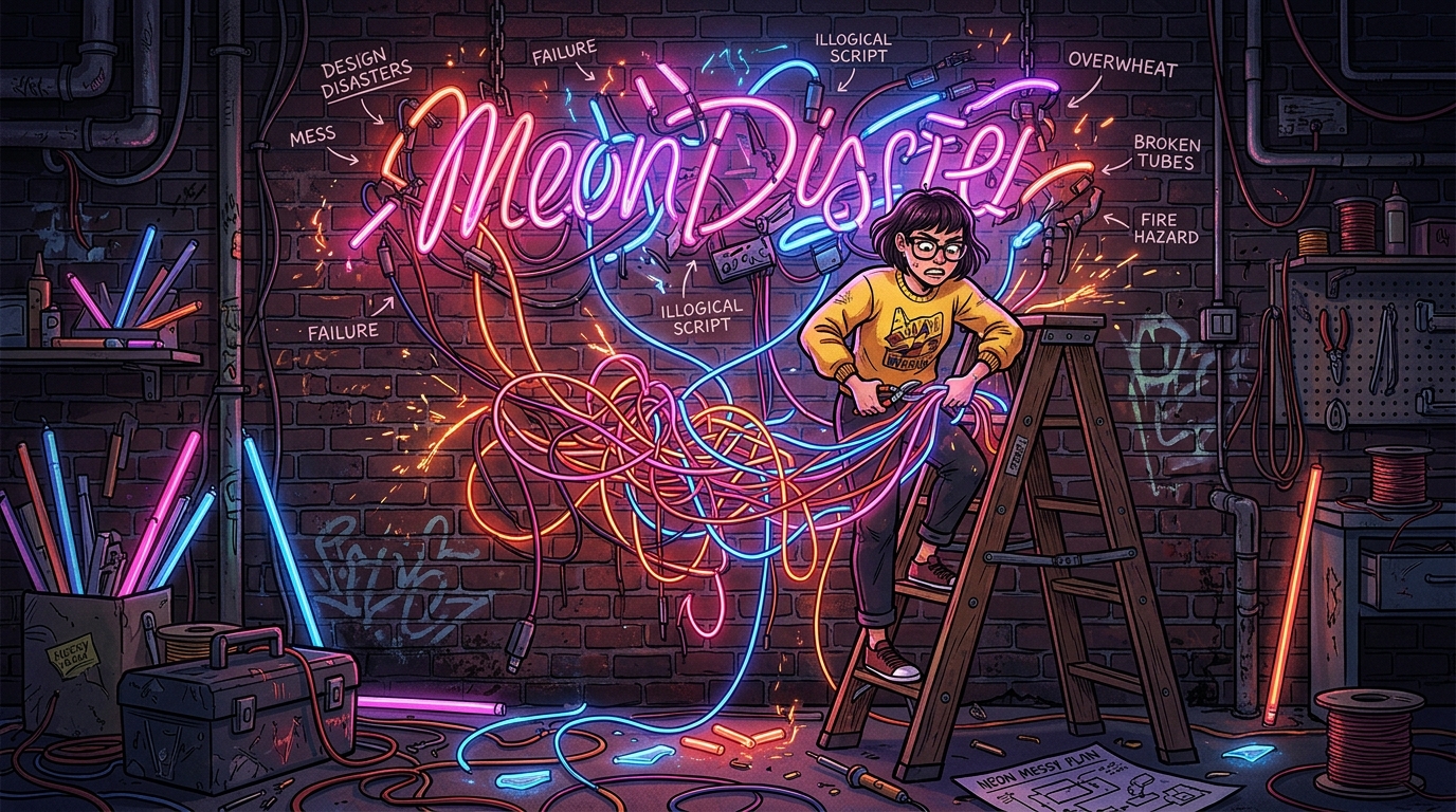
Sending a blurry JPG of your logo is the ultimate lag move when you are trying to level up your space with custom neon. Think of it like trying to play a high definition game on a dusty old CRT monitor from 1985. When you provide a low resolution image, design software sees a pixelated mess instead of the crisp, clean lines needed for a masterpiece. This creates massive technical debt because professional designers have to manually rebuild your art from scratch, which pushes your delivery date further into the future. You want your sign to arrive at warp speed, so starting with a high-resolution vector files is the cheat code you need.
Vector files are the secret sauce because they use math instead of pixels to define shapes, meaning they stay sharp at any scale. Whether you are aiming for a tiny desk lamp or a massive wall feature, these files ensure your glowing aesthetic looks like a million bucks. If you hand over a file that looks like it was captured on a flip phone, you are basically inviting glitches into your production timeline. Avoiding this mistake keeps your project out of the dreaded revision loop and ensures your colors pop exactly how you imagined them. Clean files lead to clean lines, and that is how you achieve that flawless synthwave glow without the headache.
Think of your design file as the blueprint for your neon dream, so do not let a bad upload crash your vibe. When you provide the right technical specs from the jump, you are bypassing the loading screens and heading straight to the final boss of interior design. It saves you time, saves everyone stress, and keeps the whole process feeling as smooth as a fresh cassette tape. Nobody wants to deal with a pixelated disaster when they are expecting a crisp, neon masterpiece to light up their life. Just grab that vectorized version of your logo and get ready to bask in the glorious, high contrast light of a job well done.

Leaving your LED neon sign cranked to max brightness 24/7 is the ultimate speedrun toward a total burnout. While it is tempting to let that vibrant glow bathe your room in synthwave vibes forever, even the coolest tech needs a nap. Constant operation causes thermal stress, which is basically your sign getting way too spicy for its own good. Overheating degrades the internal components and causes those crisp colors to fade into a sad, flickery mess. You want your neon gaming room setup to look like a high-score screen, not a glitchy game over.
Think of your sign like a legendary boss character that needs to manage its stamina bar to stay in the game. Running at full power all night long puts unnecessary pressure on the power adapter and the delicate LED chips. To keep your aesthetic on point for years, try using dimmers or a simple timer to give the hardware some breathing room. Lowering the brightness by just twenty percent can significantly extend the life of your glow without ruining the atmosphere. Taking care of your gear ensures your space stays legendary instead of fading into the digital void.
Avoiding a total neon “game over” comes down to thinking like a boss before you hit that order button. You do not want your epic synthwave sanctuary to look like a glitchy mess because you picked a font that is impossible to read or a size that is way too small. Remember that contrast is your best friend, so keep those colors popping against your walls like a high-score screen. If you treat your design like a legendary quest, you will avoid the technical debt of bad files and the heartbreak of a dim, flickering sign. Keep your vibes high and your technical specs tighter than a speedrunner’s record.
Your space deserves to be a glowing masterpiece that feels like a portal straight into a retro-futuristic dimension. By dodging these common mistakes, you are ensuring your setup stays legendary and your aesthetic remains top-tier for years to come. Whether you are building a gaming cave or a sleek storefront, the right lighting is the ultimate power-up for your environment. If you are ready to level up your entire aesthetic, you should definitely Upgrade Your Workspace With Retro Futuristic Office Supplies to complete the look. Discover how neon diner signage can help you build the ultimate neon-soaked dreamscape today.
Stop trusting your laptop screen and measure your actual space like a pro. A solid rule of thumb is to aim for at least one inch of letter height for every ten feet of viewing distance. If you do not scale it up properly, your epic centerpiece will end up looking like a tiny, glowing postage stamp.
You probably picked a font that is way too cramped or complicated for a neon glow. Stick to clean, bold lines and give your letters some room to breathe so they do not bleed into a messy blob. Think of it like setting your resolution to 4K instead of a pixelated mess.
You can, but choosing ‘invisible’ colors that blend into your wall is a total rookie move. Make sure your neon color has high contrast against your background so it actually pops like a synthwave sunset. If you pick a color that matches your paint, your sign will disappear into the shadows like a stealth mission gone wrong.
It creates a serious aesthetic fail known as the Paper Scale Problem where your decor looks totally out of proportion. A massive, empty wall will swallow a small sign whole and make it look like a thumbnail instead of a boss-level feature. Always measure twice and go bigger if you want to avoid that embarrassing ‘Game Over’ screen.
Investing in high-quality power supplies and LED materials is the only way to keep your glow steady. Cheap components will leave you with a glitchy, flickering light that feels more like a haunted basement than a cool retro lounge. Level up your hardware from the start to keep the vibes consistent and bright.
The secret is avoiding thin, script fonts that are impossible to read when they are glowing. Choose a font with a consistent thickness that looks great even when your eyes are a bit tired after a long gaming session. Simple, recognizable shapes are the real cheat code for a sign that slays.