If your eyes have ever been lovingly assaulted by a neon explosion of squiggles and triangles while watching Saved by the Bell, you’ve already met the chaotic energy of memphis design patterns. Born in the 80s as a giant middle finger to boring, beige minimalism, this style is basically a synthwave fever dream brought to life. It’s loud, it’s tacky, and it looks like a geometry textbook decided to throw a rager in a laser tag arena.
You’re here because you’re tired of “clean” aesthetics and want to inject some high-voltage kitsch into your life. Whether you’re building a retro gaming room or just want your graphics to scream with the power of a thousand electric pink laminates, these bold motifs are your secret weapon. It’s time to embrace the clashing colors and weird shapes that defined an era of glorious architectural rebellion.
In 1981, a group of rebel designers led by Ettore Sottsass decided they were bored to tears by the beige walls and stiff furniture of the era. They gathered in a smoke-filled room in Milan, cranked up some Bob Dylan, and birthed a style that looked like a Saturday morning cartoon exploded into real life. This wasn’t just a design choice, it was the radical birth of Memphis as a full-blown middle finger to the “less is more” rules of the past. By swapping out expensive wood for cheap plastic laminates and neon colors, they created a visual language that felt like a glitch in the matrix of high-end decor. It was loud, it was weird, and it was exactly what the world needed to kickstart the most iconic decade of all time.
You probably recognize this vibe from the opening credits of Saved by the Bell or the food court at your local 80s mall. The Memphis look is all about those chaotic squiggly lines, chunky triangles, and polka dots that seem to dance across the surface. Instead of matching colors, these designers threw neon pink, electric yellow, and primary blue together with bold black-and-white stripes just to see what would happen. It is a playful mix of Art Deco shapes and 1950s kitsch that refuses to take itself seriously. This aesthetic is the ultimate bridge between high art and the pixelated, neon-soaked world of early gaming and synthwave culture.
Stepping into a Memphis-inspired room feels like you accidentally clipped into a video game level from thirty years ago. The patterns are deliberately asymmetrical and jagged, making every chair and lamp look like it belongs in a pop art gallery rather than a boring living room. While critics at the time called it tacky or garish, the rest of us know it as the peak of retro-cool. Today, these zigzags and geometric shapes continue to influence everything from web design to streetwear for anyone who wants to ditch the minimalist life. It is the perfect way to bring some high-energy, nostalgic chaos into your digital or physical space.

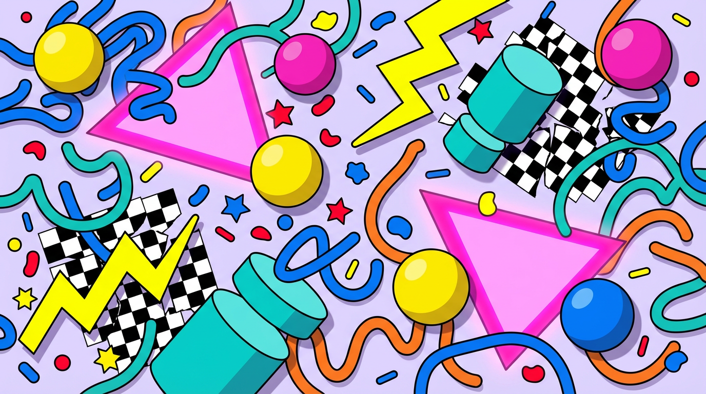
At the heart of every memphis design patterns lies the legendary squiggle, a wiggly line that looks like it was doodled during a very long phone call. These erratic shapes are usually paired with floating triangles and circles that seem to defy the laws of gravity. You will notice that nothing is ever symmetrical or predictable, which is exactly why it feels so energetic. These geometric building blocks create a sense of organized chaos that defined the look of every cool 80s mall. It is a visual language that screams fun and refuses to take itself seriously for even a single second.
The color palette is where things get truly wild, ditching boring neutrals for a neon punch to the face. You will find electric pinks, bright yellows, and saturated blues clashing against black and white graphics like the famous Bacterio pattern. This specific look, created by Nathalie Du Pasquier, uses squiggly black marks on a white background to add texture and depth. It is the exact same aesthetic that made the Saved by the Bell intro so iconic and memorable. These colors do not just sit there, they vibrate with a kitschy energy that feels like a Saturday morning cartoon come to life.
To master this style, you have to embrace the idea that more is definitely more. You can scatter confetti like polka dots across a canvas or stack thick stripes in directions that make no sense. The goal is to blend Art Deco shapes with a heavy dose of 1950s diner kitsch. Every element should feel playful and a little bit tacky, rejecting the idea that design needs to be clean or minimal. When you throw all these clashing patterns together, you get a nostalgic vibe that is perfect for anyone who misses the glory days of pixelated graphics and neon arcade carpets.
Memphis design is the secret sauce for anyone looking to channel that iconic 1980s mall energy without going full dark synthwave. While outrun focuses on moody sunsets and grid patterns, Memphis patterns are all about that chaotic, Saturday morning cartoon energy. You can easily spot these motifs by their signature squiggles, floating triangles, and the kind of confetti patterns that look like they belong on a Trapper Keeper. Integrating these into your digital space means embracing bold black lines paired with clashing neon yellows and electric blues. It is a playful radical rejection of minimalism and neutral tones that dominate the modern web.
To pull off this look like a pro, you need to master the art of organized chaos in your layouts. Start by scattering some chunky geometric shapes and thick zigzags across your background to break up the visual flow. These patterns should feel a bit like a game of Tetris that went through a blender, mixing polka dots with asymmetrical stripes. You do not need to be a master architect to revamp your space and appreciate how these kitschy elements create a high energy vibe for your stream overlays or social media posts. Just remember that more is usually more when you are trying to capture that authentic Saved by the Bell aesthetic.
Mixing and matching these retro motifs is the best way to prove you are not just another poser jumping on a trend. Try layering some terrazzo textures over bright plastic laminates to give your designs that authentic 1981 Milan gallery feel. Since this style was born from a bunch of designers listening to Bob Dylan and hating on boring furniture, you have full permission to be as loud and tacky as you want. Keep your colors punchy and your shapes floating freely to ensure your digital den looks like a neon fever dream. It is all about celebrating the weird, colorful history of postmodernism while keeping your creative projects looking totally tubular.
Memphis design patterns are the ultimate visual sugar rush that refuses to fade into the background. While the world of modern design often tries to stay quiet and minimal, these squiggles and polka dots are here to turn the volume up to eleven. You can see their DNA everywhere from your favorite retro gaming UI to those iconic 80s mall food courts that live on in our collective memory. This gloriously tacky style works because it prioritizes personality over perfection, proving that clashing neon pinks and electric blues can actually be a match made in heaven. It is a loud celebration of the postmodern party that started in an Italian design studio and ended up defining an entire decade of pop culture.
Keeping the spirit of Ettore Sottsass alive in your own projects is easier than ever if you embrace the chaos. You do not need to be a professional architect to throw some thick black lines and geometric shapes onto a canvas. Just remember to ditch the rules of symmetry and let your inner 80s kid run wild with high contrast patterns and playful asymmetry. Whether you are designing a synthwave album cover or just want your social media feed to pop, these patterns offer a refreshing break from the boring and the beige. The Memphis Group taught us that design should be fun, so go ahead and make something that would look right at home on the set of a classic Saturday morning sitcom.