
1980s sci-fi book cover art was all over the place, but the look that stuck was the one on UK paperbacks: smooth, airbrushed space scenes with enormous spacecraft hovering over alien worlds. Painters like Chris Foss, Tim White and Jim Burns made those ships the stars of the shelf, while across the Atlantic, Michael Whelan won the Hugo Award for Best Professional Artist ten times between 1980 and 1991.
Not every cover was about giant ships. Penguin’s mid-1980s sci-fi books used eye-catching titles and varied layouts, and by 1987 the publisher was reviving pulp-magazine styling. Rick Berry’s 1985 cover for William Gibson’s Neuromancer became the first computer-generated cover for a novel, a neon-lit preview of cyberpunk.
The giant spaceships on UK paperbacks were painted in a style associated with Chris Foss, and Tim White and Jim Burns worked in it too. That smooth, airbrushed look dominated British science-fiction shelves through much of the 1970s and 1980s, which is why so many people picture 80s sci-fi as a parade of chrome cruisers over alien skies.
The Encyclopedia of Science Fiction describes these covers as smooth and airbrushed, with vast spacecraft filling the frame. With no rough brushwork to distract the eye, every hull looked polished, sleek and a little bit impossible. Planets rose in the background, moons hung in the sky, and the ship was almost always the biggest thing on the page.
Why did the style stick? A paperback cover is a tiny billboard, and a ship the size of a city tells you in half a second that you’re holding a space adventure. Publishers loved a look that sold the story at a glance, and readers came to expect it. Spotting a sci-fi novel in a crowded bookshop was easy: just look for the gleaming hull hanging over a purple planet.
That glossy, sunset-lit scene is a direct ancestor of the synthwave look you see today. Chrome, glowing horizons and huge machines in an empty sky still make people grin, which is why these old paperbacks keep turning up on retro fan boards and in gamer memes. Who knew a battered paperback could double as the original vaporwave wallpaper?
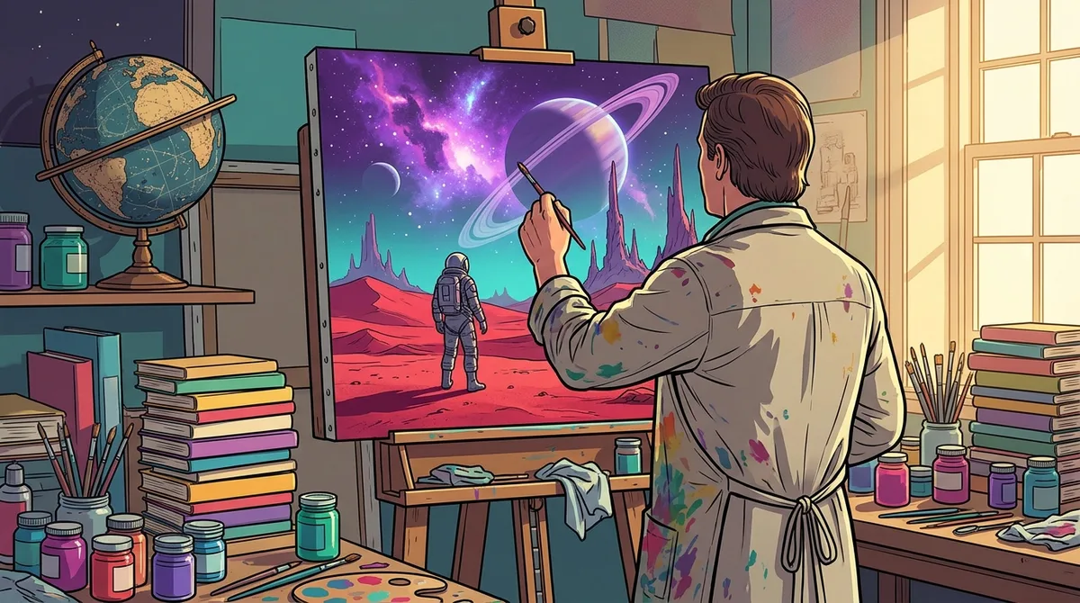
Michael Whelan dominated the decade by winning the Hugo Award for Best Professional Artist ten times between 1980 and 1991, and he took the trophy in all but two of those years. That’s the kind of run that makes other painters wonder what they’re doing wrong.
Whelan’s work leaned into rich, painterly fantasy and sci-fi imagery. Where the UK airbrush crowd gave you slick, gleaming hulls, Whelan gave you visible brushwork, deep color and moody light. His worlds felt like paintings you could step into: glowing skies, strange creatures and lone heroes standing small against huge landscapes. Picture a sunset full of magic with a spaceship photobombing the corner, and you’ve got the general idea.
Why did his style become the benchmark? Part of the answer is that his covers made a story feel bigger than the paperback it came in. A good Whelan image promised wonder before you read a single line, which made it easy for other artists and publishers to see what a successful cover looked like. Even today, his painted scenes show up on retro fan boards as shorthand for 80s fantasy at its most dreamy.
Across the Atlantic, the 1980s brought a different mood. American covers gradually moved away from gleaming machines and toward fantastic subjects like wizards, monsters and mythic warriors. The shelf became less about the hardware and more about the magic.
Don Maitz is one of the artists whose covers often favored fantasy over technology. A spaceship might still appear, but it was usually a supporting player rather than the star. Scan a rack of paperbacks from that era and you’ll notice more lone figures with swords than chrome cruisers.
Michael Moorcock’s Elric books show the same shift on the fantasy-leaning side of the sci-fi shelves. Elric’s brooding hero suited bold, colorful heroic painting, with strong figures, saturated colors and dramatic skies. The result looked like a fantasy movie poster that had teamed up with an album cover.
Those images told you what kind of story waited inside before you read a single word of the blurb. A hero standing against a fiery sky promised adventure faster than a spaceship could. If you love that burst of color and drama, you’ll recognize the same energy in the neon, glowing horizons and bold lettering that fuel today’s retro fashion.
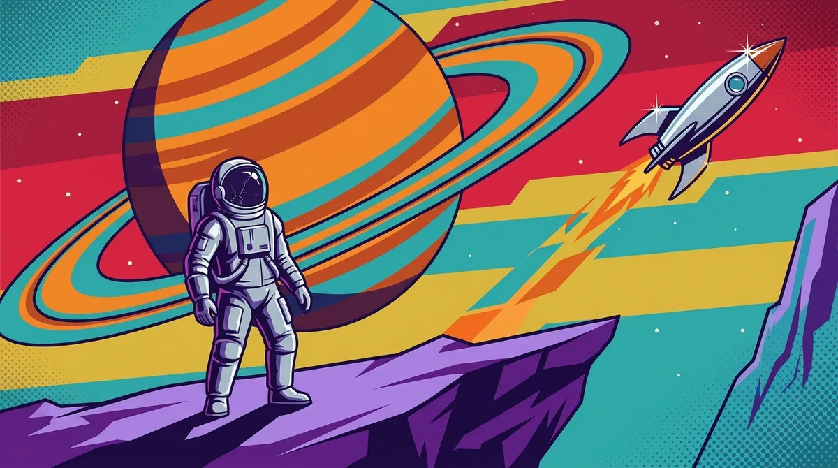
Penguin used modern art and pulp styling to make covers that shouted from the shelf, then looked back to the magazine covers that came before. Its mid-1980s science-fiction books treated the cover as a poster, and the bold type and offbeat layouts were designed to stop a browser in a crowded shop.
The pulp look had deep roots. Frank R. Paul painted many covers for Amazing Stories, packing rockets, ray guns and strange planets into a single crowded frame. Those covers taught readers that a sci-fi magazine should look bright, busy and a little bit wild.
Edgar Rice Burroughs’ John Carter novels carried that same energy into later decades. When publishers reissued them, the covers leaned on dramatic heroes, alien skies and chunky lettering that announced adventure before you ever opened the book.
Mass-market paperbacks from Pocket Books and Ace Books had to fight for attention on crowded racks, so their covers were built to grab a quick glance. Bold color and punchy titles were the tools of the trade.
By 1987, Penguin’s pulp-styled series turned that old look into a selling point rather than an afterthought. It was a throwback that said, “Remember when sci-fi covers looked this exciting?” The same idea powers modern retro shirts, where bold lettering and loud color do the talking before anyone reads a word.
The first computer-generated cover mattered because it showed a book could look like the future instead of a painting of it. Rick Berry’s cover for Ace Books’ 1985 reprint of William Gibson’s Neuromancer was the first computer-generated cover for a novel, trading hand-painted brushwork for a digital glow.
For a genre that had spent decades painting spaceships by hand, that was a big leap. The cover didn’t need a gleaming hull to say “future.” It said so through the machine itself, which suited a story about hackers plugging into cyberspace.
Berry kept going. In 1987 he made the first paperback covers for Count Zero and Burning Chrome, both Gibson books. The faces on those covers were distorted, as if a glitchy screen had warped them. Count Zero leaned on brown shades, while Burning Chrome went metallic blue, a palette that looks like chrome under neon light.
That look changed how cyberpunk fiction dressed on the shelf. Instead of a ship drifting over an alien world, readers got a human face coming apart, a hint that the danger lived inside the machine and inside the characters. The covers stopped promising outer space and started promising a wired, unstable city.
If you want that mood on your own chest, brown and metallic blue make a cyberpunk mood board in two colors. Glitchy graphics and chrome tones fit right in with retro-inspired tees, and a loud shirt can start a conversation faster than any blurb.
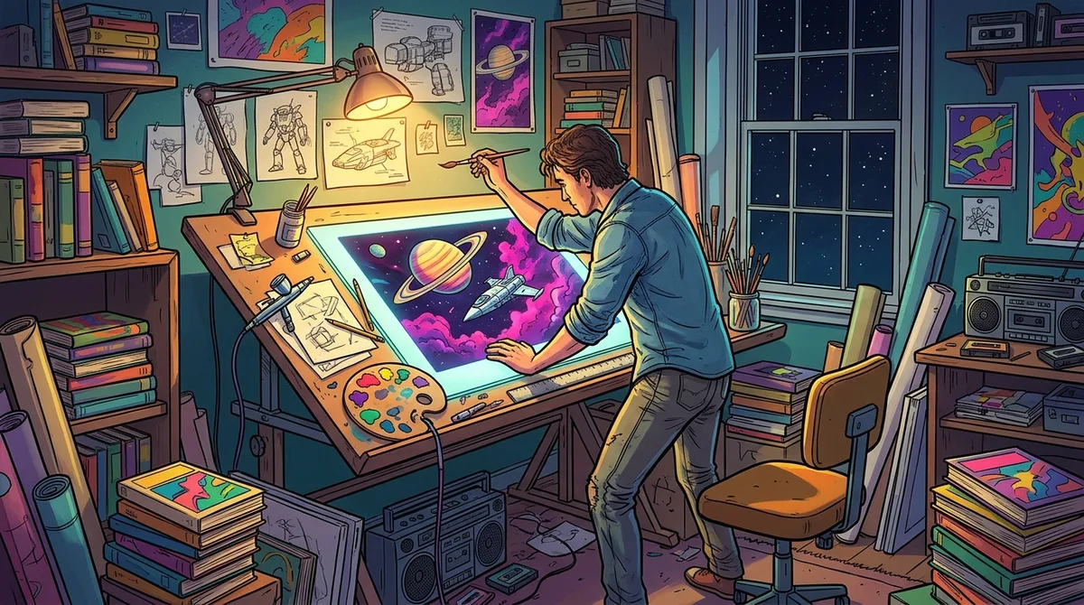
Quite a lot, as it turns out. Illustrator Gerry Daly recalls that his Pocket Books commissions allowed up to three or four weeks from commission to final artwork. That window covered reading the manuscript, sketching rough ideas and developing the concept before any real painting began.
The money was modest. Daly recalled that his early-1980s A. E. van Vogt cover commissions averaged about $1,700 per cover, and that fee covered reproduction rights only.
Size mattered too. His science-fiction paintings were generally 20 × 30 inches and included bleed, the extra border that let an art director reposition or resize the image for a full-bleed cover. Bleed gave the designer room to play without leaving an awkward white edge.
Printing was changing as well. In the mid-1980s, laser scanning artwork on flexible supports such as paper became an option, but covers were still printed with traditional four-color plates. The painting went digital on the way in, while the printed cover stayed rooted in classic ink.
Bleed still shows up on modern shirts. Retrowave’s all-over-print t-shirts carry graphics across the whole garment, so the design has to wrap past every seam, much like a painting that runs off the edge of a cover.
Today, people treat those old paperback covers as collectible design. Bold type, airbrushed spaceships and neon-bright palettes are the ingredients that make them worth a second look, and they work just as well on a shirt.
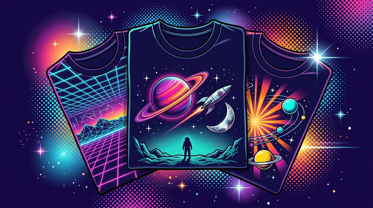
Retrowave sells graphic tees with retro, vaporwave, synthwave and 80s-inspired designs, so you can wear a glowing horizon instead of just staring at one on a shelf. Standard unisex graphic tees are 100% Airlume combed and ringspun cotton in a light 4.2 oz/yd² fabric, with a retail fit. They run true to size, but check the size chart on each product page before you order.
Want the whole poster on your back? The Blue Rays all-over-print tee is 100% polyester with a regular fit, available in 4.0 oz and 6.0 oz fabrics. It’s tagless, so nothing scratches your neck while you chase your own wormhole. It also runs true to size, so your usual size should be a safe bet.
Before you click buy, run through a quick pre-flight check. Start with the size chart on each product page. Standard tees run true to size, so your usual size should be a safe bet.
Once your order is placed, you’ll receive a confirmation email. Sign up for the newsletter too, because it announces occasional promotions and new arrivals.
Ready to make your move? Start by picking your style: a standard tee for everyday wear, or the Blue Rays all-over-print shirt if you want the whole poster on your back. Standard graphic tees are listed at $27.00 and often on sale for $22.95, while AOP shirts are listed at $32.00 with a sale price of $27.20.
Then check the shipping details for your country. Retrowave ships to most countries, but costs and delivery times vary by destination, so look those up before you check out. You can pay with Visa, MasterCard, American Express, PayPal or other digital payment platforms.
After you order, keep an eye out for your confirmation email. Once your shirt arrives, leave a review on the product page to help the next synthwave fan pick their size.
Got a question before you buy? Contact Retrowave by email or through the Contact Us page.